Client

Corum is a french asset management company specializing in savings and investment solutions, primarily through real estate and bond funds. They provide individual investors with accessible, high-performance financial products, helping them grow their wealth over the long term. Corum offers solutions tailored to diverse investor profiles, with options in real estate investment trusts (REITs) and corporate bonds across Europe.
Product
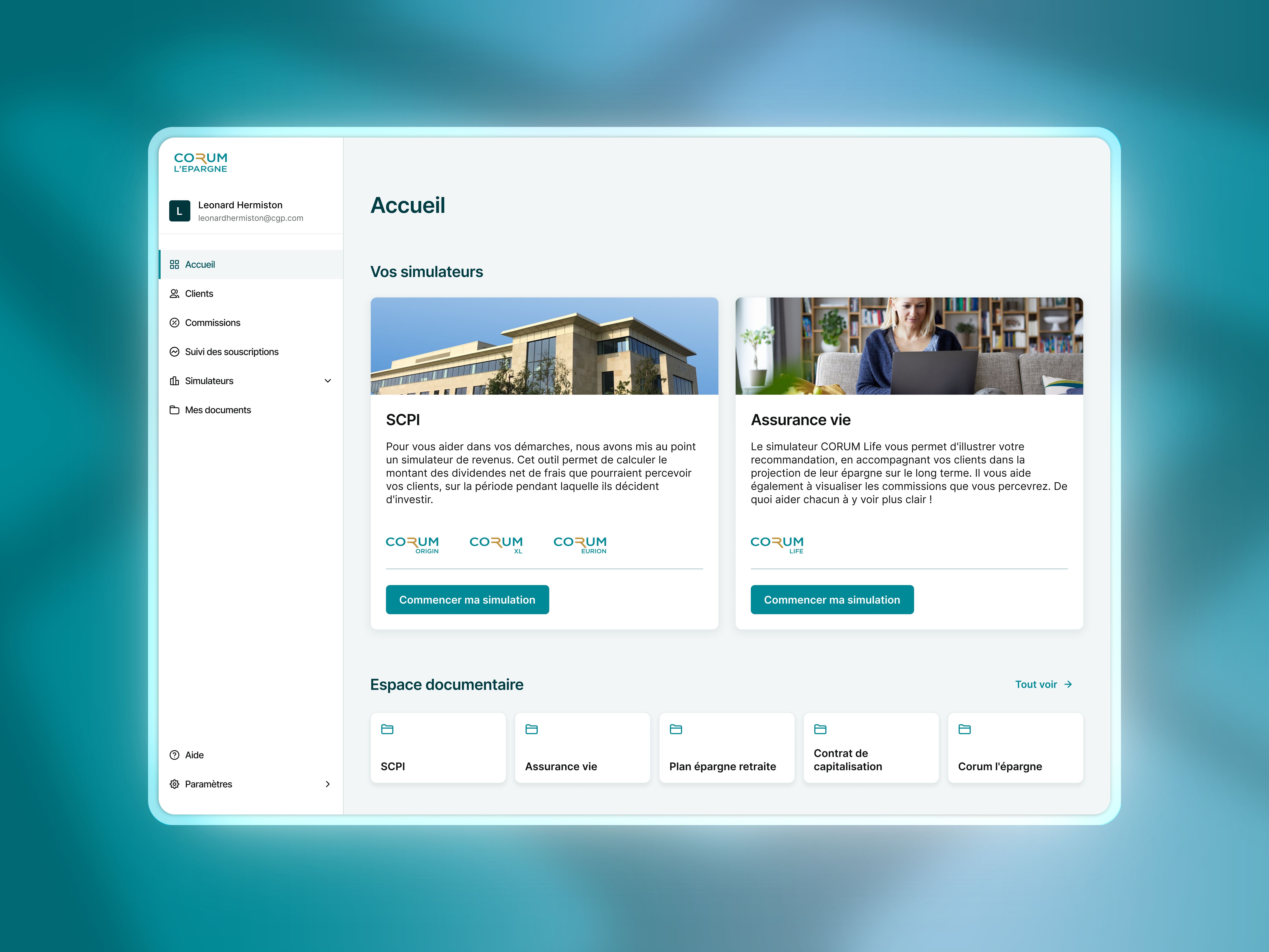
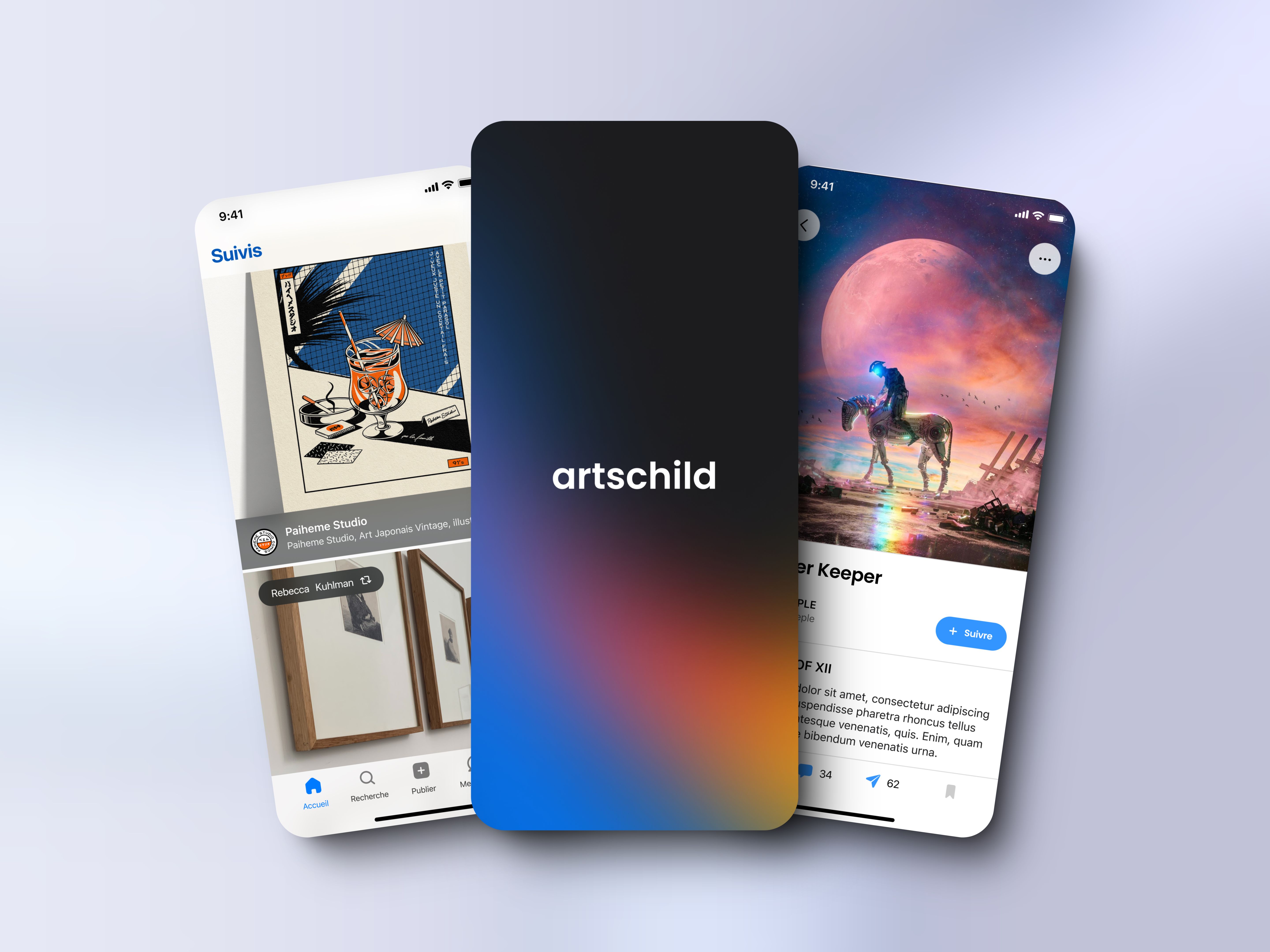
I worked on the client spaces meant for B2B clients, such as Wealth Management Advisors (WMA), who manage both individual and corporate clients and I also worked on B2C spaces for individual clients who may or may not be managed by a WMA.
Through these platforms, users can monitor their investments and make additional ones, either independently or co-piloted by their WMA. Clients can access their spaces via the web and a mobile app, though most of my work was concentrated on the B2B web platform.
Business requirements
The main business objectives of the design system were to :
Reduce development costs & accelerate time to market.
Enhance scalability for future growth.
Agile and flexible workflow.
Improve visual consistency.
Facilitate onboarding & collaboration between designers and developers.
Role & Contribution
As a freelance product designer working alongside the product team, I was commissioned to reinforce the development of the design system. I approached the identified issues from the following angles :
Designer-developer workflow
I focused on enhancing collaboration through Figma and supernova by establishing a robust documentation system to bridge the gaps between all teams.Design tokens
I addressed the modularity issues in several components, and incorporated design tokens to address numerous issues such as visual consistency and scalability, while also create a common language between design and development that would fostered more collaboration.
The design tokens then helped us ensure a smooth transition to the visual redesign carried out by the BETC and Extreme agencies.
Audit & Challenges
As the demand for new features and product evolution grew, significant discrepancies started to appear between the mockups and the final developed product. Moreover, delivering a cohesive user experience became increasingly challenging for designers both in terms of execution and time as the need to implement changes mounted.
To address these issues, I conducted a thorough audit of both the product and the design system. This was followed by a series of workshops involving key stakeholders. Through these efforts, we uncovered multiple root causes behind the problems met.

Low reusability of components
Most components lacked modularity, which limited their reusability and scalability. Without smaller, flexible building blocks, they were challenging to adapt to various contexts.
Component redundancy
Poor component modularity led to redundancy in the component library. Because components couldn’t be easily repurposed, designers often had to recreate similar variants for each use case. As a result, multiple nearly identical components emerged, complicating design decisions and cluttering the library. This redundancy increased maintenance, undermined visual consistency, and made it harder to identify the most suitable components.
Lack of communication between teams
Two separate development teams worked on different parts of the same product (private spaces and tunnels), leading to fragmented efforts. Each team maintained its own component library, faced unique constraints, and used different workflows, causing inconsistencies throughout the product. In addition, many times some components were never developed by the other team.
No documentation
The lack of documentation widened the gap between designers and developers. Without clear guidelines, communication broke down, leading to inconsistencies in usage and implementation. It also undermined team alignment, already strained by component redundancy, and hindered new member onboarding.
Optimizing the Figma workflow
Several best practices were missing and needed to be implemented in Figma. Many components were scattered across separate files, while others were detached from most mockups. Styles were sometimes applied inconsistently.
To address this, the first step was to establish a consistent design methodology. We consolidated all fundamental elements—colors, typography, spacing rules, and grids—into a single file called “Foundation,” making it easier for designers and developers to locate and use the right elements.
Next, we focused on components. They were often designed for very specific use cases and created directly within mockups, causing them to be scattered across various files. Using Figma Analytics, we consolidated everything into a single file called “Component library.” We also analyzed their insertion and detachment rates to identify which components were obsolete or needed revision. Although this made the library easier to maintain, it was time-consuming and required numerous meetings with both development teams to understand how they managed components on their side.
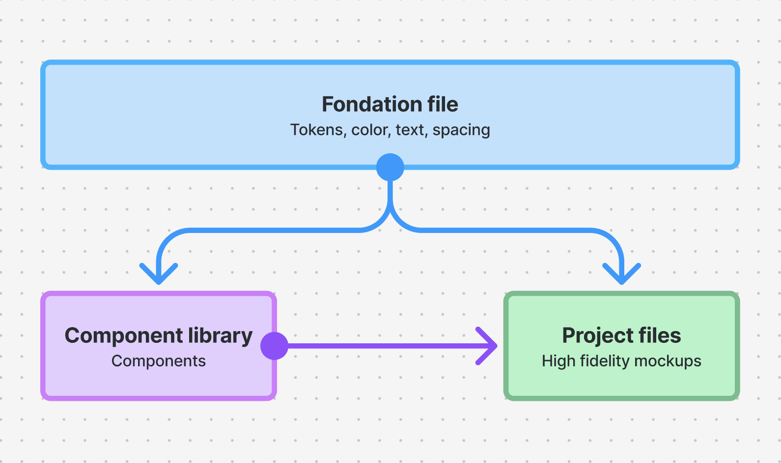
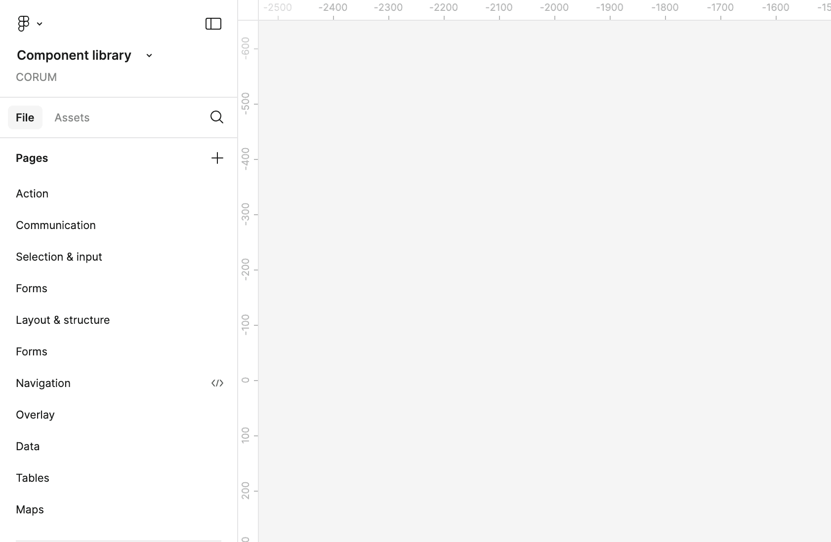
The final step in streamlining Figma was renaming the “Component library” pages into logical component families (navigation, overlay, fields, selection, communication, forms, tables, etc.). This simple change made the library more intuitive and easier to navigate.
By grouping components into clear families, we :
Clarified each group’s purpose, helping identify redundancies and missing elements.
Boosted design system consistency, encouraging designers and developers to pick the right component.
Reduced the time spent searching by avoiding a long list of unrelated items.
Improved onboarding for new team members, allowing them to quickly grasp the library structure.
Documenting the design system
After removing redundancies and making some components more modular by breaking them down into smaller elements, we continued building a cohesive design system by setting up standards and guidelines in Supernova, making it our single source of truth.
We reviewed each component, starting with the most commonly used ones like buttons, fields, tabs, toggles, and tables. These reviews took place during our weekly meetings between designers and front-end developers, where we analyzed their visual properties, variants, states, copy, and more to ensure consistency and address any discrepancies between design and implementation.
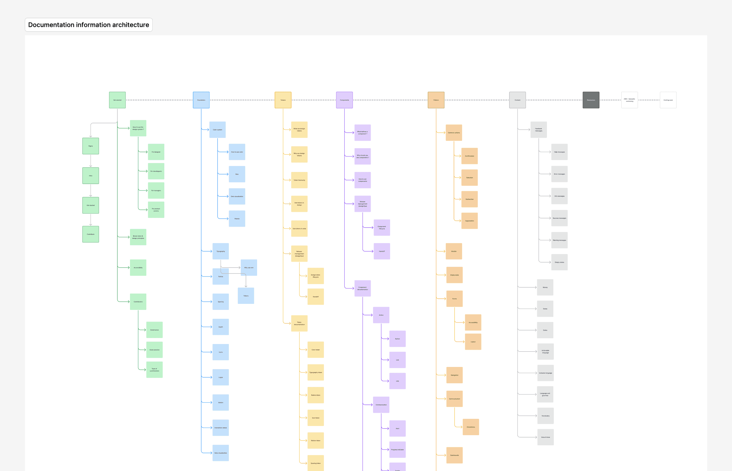
We began with incremental steps for the documentation, understanding that it is an ongoing project. We established an information architecture, outlining all the sections we wanted to include. This included a 'Foundation' section to present our color system, typography, spacing, data visualization, and more, as well as dedicated sections for components, patterns, and content.
Introducing design tokens
To address visual inconsistencies (colors, text, spacing units…) and scalability issues in our design system, we adopted design tokens. In case you’re not familiar with them, design tokens are variables that store design decisions such as colors, typography, spacing, and other UI choices.
I presented the benefits of design tokens to stakeholders through a detailed presentation, highlighting how they could resolve existing issues and enhance our workflows. After testing the approach in a controlled environment, we chose to implement it gradually due to the following advantages :
Visual consistency
Design tokens allow us to centralize design decisions and ensure consistency across platforms and components. Updates to key elements (colors, typography, etc.) are then reflected consistently throughout the product.
Scalability
Design tokens make it easier to update modular components, especially during a redesign. Style changes propagate consistently, reducing development time and enabling efficient scaling.
Better collaboration
Design tokens establish a shared language between designers and developers, minimizing misunderstandings and ensuring accurate implementation.
Efficient theming
Design tokens speed up theme and branding adjustments. Changing a single token updates the entire system, allowing quick responses to brand evolutions and customization needs.
I also took the time early on to document the concept of tokens for the team on Supernova :

The token taxonomy
I facilitated workshops (some inspired by Nathan Curtis’s work) bringing together designers and developers from all teams to create a clear, easy-to-adopt, and scalable token structure. We reviewed every component and template characteristic we used, also drawing inspiration from well-known design systems like Primer and Polaris.
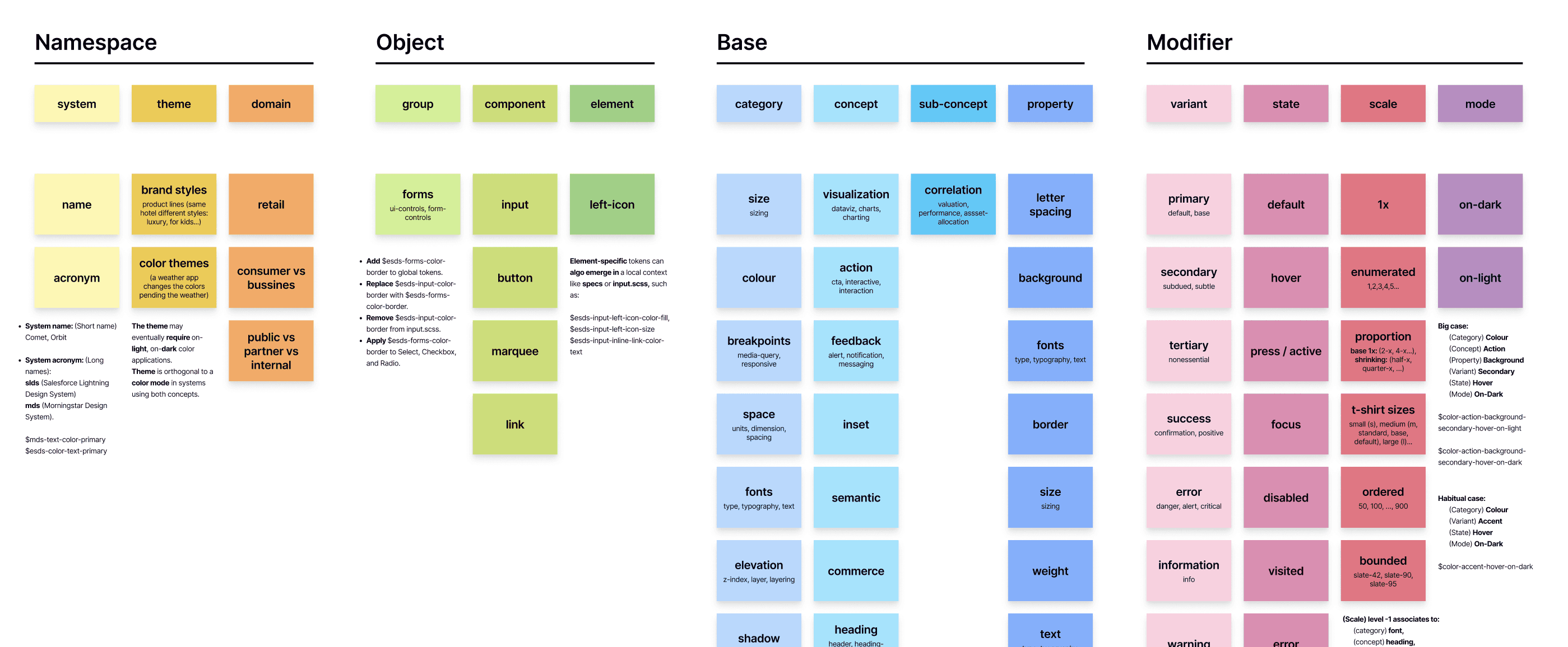
Our tokens followed a structured format like --cds.button.color.surface.primary, where each segment of the name conveys specific information in a defined order. This organization ensures consistency and scalability, as the order of each segment is key to easily extending and adapting the tokens for future needs.
This was perhaps the most challenging aspect of working with tokens: striking a balance between brevity and clarity, ensuring names remained short enough for efficient use while still being understandable.
Here's a few examples of the different parts of our token taxonomy that can be broken down as follows :
Object
Component
Element
button
form
left-icon
right-icon
Base
Category
Concept
Property
color
font
spacing
size
shadow
breakpoint
communication
vizualisation
action
text
size
surface
weight
border
letter-spacing
Modifier
Variant
State
Scale
Context
primary
secondary
tertiary
default
success
danger
breakpoint
enabled
hover
active
pressed
selected
disabled
50
100
150
small
medium
large
muted
subdued
bold
b2b
b2c
The token system
Our tokens are organized into three main groups to address different levels of abstraction, ensuring the design system remains adaptable and scalable as needs evolve.

Primitive tokens (Base or global tokens)
These tokens contain raw, hard-coded values without any contextual information. For example, the blue.800 token has the value #0E5E77, but the hex code alone doesn’t specify where or when it should be applied. These tokens primarily serve as the foundation for all other design decisions and are never referenced directly in our components.
This would be the equivalent of how we used the Figma styles before design tokens.

Semantic tokens
Unlike primitive tokens, semantic tokens don’t hold raw values; they reference primitive tokens instead (e.g., --cds.color.brand.primary = blue.800). This maintains consistency and adds context (for instance, --cds.color.text.danger for error messages), making it clearer when and how each value should be applied.

One of the main challenges we faced with Figma styles and the lack of documentation was the absence of clear guidance—such as which shade of green to use for a “success” state. Some designers picked “green 500,” others used “green 600” or even “green 700.” We had to memorize these choices. Design tokens solve this issue by implementing a reference system that adds an extra layer of control and creates a systematic approach to managing design decisions.

Component tokens
We also considered adding a third layer called “token components” to provide extra context for specific components. For example, the same form component could display a simplified version for B2C with fewer fields, and a more detailed version for B2B tailored to business information collection. Likewise, a dashboard component could provide different metrics depending on whether it’s for a client or a wealth manager. This approach ensured flexibility and customization.

Token management
Rebrand mode
To ensure a smooth transition during the rebranding process, I created a new theme called “rebrand” using design tokens, much like setting up a dark mode. This theme directly references the new colors and art direction defined by BETC and Extreme, allowing precise control over deployment and maintaining optimal visual consistency.
One of the key benefits of this approach is its flexibility : we can gradually introduce the new brand elements without overhauling everything at once, thereby reducing risks. It also allows for A/B tests or soft launches of the rebrand, making it easier to gather feedback before committing to a full rollout.
Once the transition is complete and all tokens are updated to the “rebrand” mode, we can simply deprecate the original mode, ensuring a clean and up-to-date system.
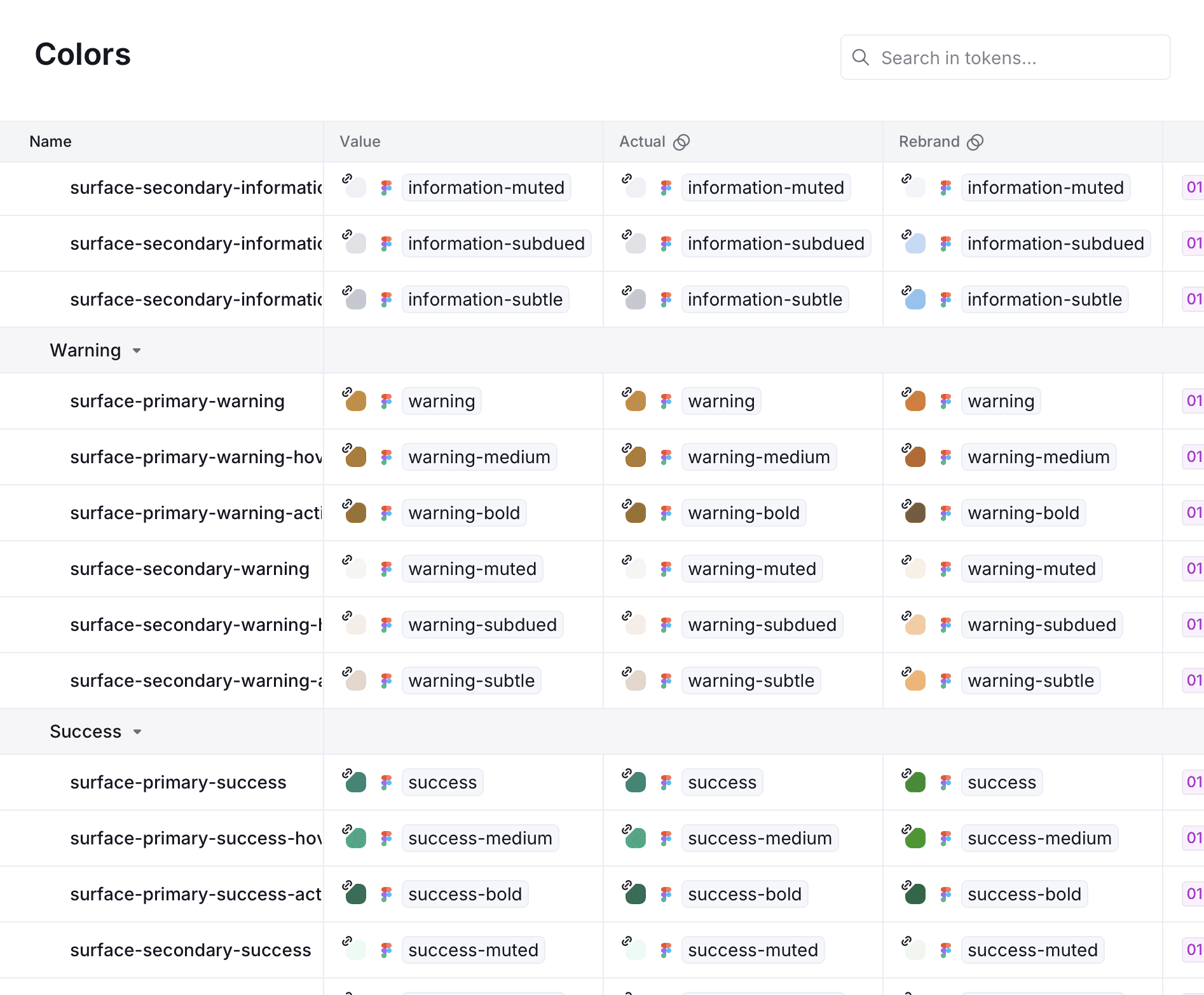
Token visual management
To support the transition, I created documentation and visual cards in Figma that outline the characteristics of each token type. This format helps us quickly spot potential issues and identify discrepancies between the new design and the original version—such as overly bright or insufficiently pronounced colors—and make precise adjustments. It also provides a clear overview of what’s been integrated and what’s still pending, as well as the potential impact a single token can have on the entire system : changing one token may affect all that reference it.
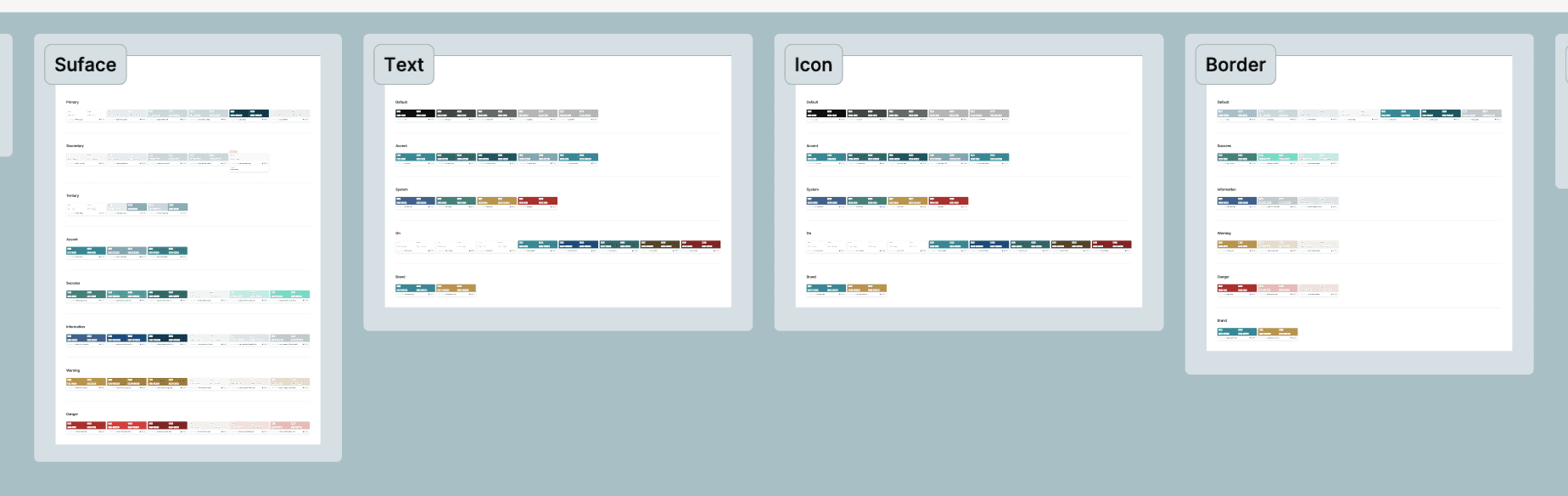

“—cds” is the token prefix indicating the design system name, here “Corum Design System.” “sys” is the part we use to indicate it’s a semantic component; we could have used “sem” instead.
A major drawback of these visual cards was the maintenance required to keep them updated and the increased margin for error due to a lack of automation. To address this, we considered setting up an Airtable database to automate certain aspects or relying solely on Supernova for token management, robust, but missing the comprehensive visual overview we needed. We were looking for a tool similar to Adobe Spectrum’s Token Visualization Tool.
Our tokens with supernova
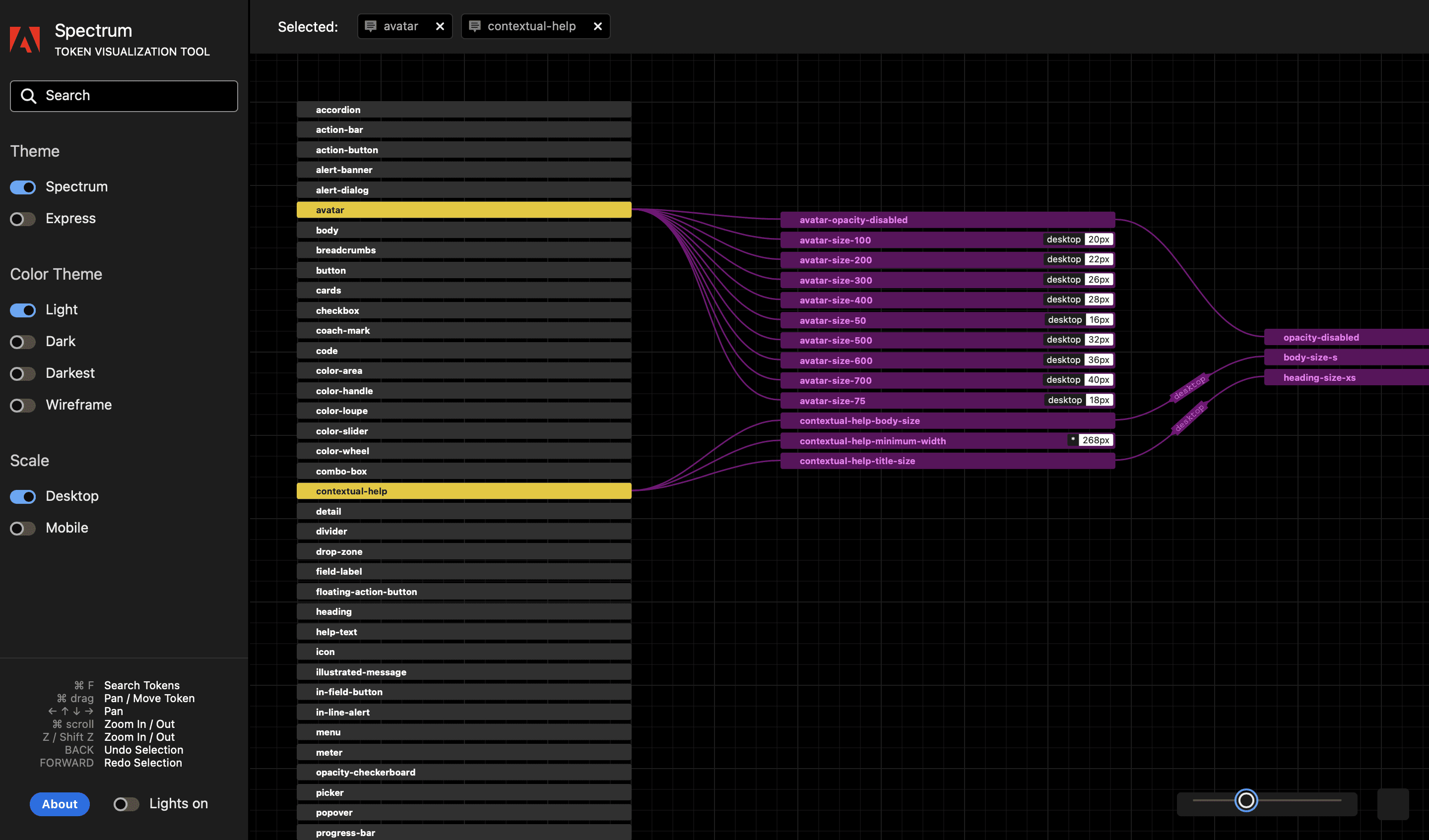
Adobe's Token visualization tool
To achieve this, we exported token collections from Figma as .json files using a Figma plugin, which offered several benefits. JSON makes data management and sharing easier while remaining platform-independent. We then imported our .json files into JSON Crack, allowing us to effectively visualize token dependencies and map out their relationships.

Final result, Impact & learnings
Mesuring success
Although my assignment ended, it was clear the project required ongoing oversight for long-term success. To ensure the design system continued providing value, I introduced several KPIs to measure its effectiveness.
I used Figma Analytics to track component reusability across various projects. By analyzing component insertion rates and variant usage, we could pinpoint underused components and identify areas for improvement. We also gathered regular feedback from both design and development teams, and I’m pleased to say the overall sentiment was positive. Developers immediately recognized the value of these efforts and actively participated in discussions.
Overall impact
Introducing design tokens significantly boosted the consistency of our design language, reducing discrepancies across teams and enabling smoother cross-functional collaboration. Designers and developers could rely on a single source of truth, minimizing confusion and misunderstandings. Documentation also played a critical role: clear, accessible guidelines lowered the learning curve, eased designers’ cognitive load, and sped up onboarding.
Key Learnings
Reflecting on this experience, I’ve learned that building an effective design system goes far beyond having the right components or design tokens in place. Team communication is paramount—once everyone understands how and why we use these elements, things run smoothly.
I also learned the value of iteration. I often strive for a perfect structure from the start, but ongoing feedback and incremental adjustments, coupled with patience, proved invaluable.
Coming next


Everything starts with a conversation
Phone number